Microsoft's user interface guidelines recommend using the "inverted pyramid" style for UI text in dialog boxes.
In the inverted pyramid structure you get right to the point with the essential information, let users stop reading at any time they choose, and use a Help link to present the remainder of the pyramid.
It also recommends avoiding over-communication and using the prominent main instruction to explain concisely what to do.
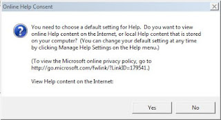
I recently ran into this Visual Studio 2012 dialog box:
It did not heed to the above guidelines and it took me more than just one reading to get the message.
Related:
- UX anti-patterns & other avoidable annoyances
- User Experience - Stack Exchange: Should I use Yes/No or Ok/Cancel on my message box?


0 comments:
Post a Comment